Two habits that get you the best output, not just a working one.

Figma wireframes only ever showed intention: what a screen was supposed to do. Today, for the same effort, you can hand over something that actually behaves, real clicks, real states, real edge cases. That's a different kind of proof.
Shows the happy path. One state, guessed by hand.
Real interaction, real copy, real breakpoints. Still a draft.
Cheap to generate. Expensive to actually read.
Past about a page, you stop reading and start skimming.
Skimming is how the big picture gets lost.
Most Plan Mode reviews are exactly this: a markdown plan, skimmed the same way.
# Findings ## Method Sample of 40 sessions, filtered to first-time users only. Recorded via session replay, coded independently by two researchers. ## Results - Completion rate: 62% - Drop-off point: step 3 - Median time: 4m12s - Time-on-task variance: high (σ = 2m40s) ## Drop-off analysis Step 3 asks for a value most users don't have on hand yet. Nine of eleven drop-offs paused here, then never returned in the same session. ## Quotes "I didn't know what number to put here, so I just left the tab open." "I figured I'd come back to it later. I didn't." ## Secondary findings - Users skipped the tooltip entirely - Mobile completion rate is 18 points lower - Returning users complete 2.3x faster ## Recommendations 1. Move step 3 later, after users have more context. 2. Pre-fill the value where possible. 3. Re-test with a smaller sample post-fix. ## Appendix Raw session IDs and timestamps in sessions-raw.csv. Full transcripts available on request.
Same content, structured: headings, spacing, hierarchy.
You see what matters at a glance, not just what came first.
Keeps you reviewing it, not just approving it.
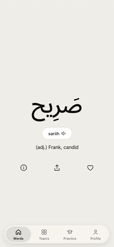
A research tool. Comparing two Arabic voice models, word by word.
A mockup. Testing a "talk to a native speaker" feature before writing the real one.
The real app. Shipped, live, used on a commute.
A decision tool. Picking between two voice options before committing to one.
A regression check. Same voice, same words, across model versions.
An investigation. Checking a voice's claimed accent against how it actually sounds.
A sandbox. Built in the real app's own design system, not a one-off style.
A draft. Proposed vocabulary, marked unreviewed, before it ever touches the real deck.
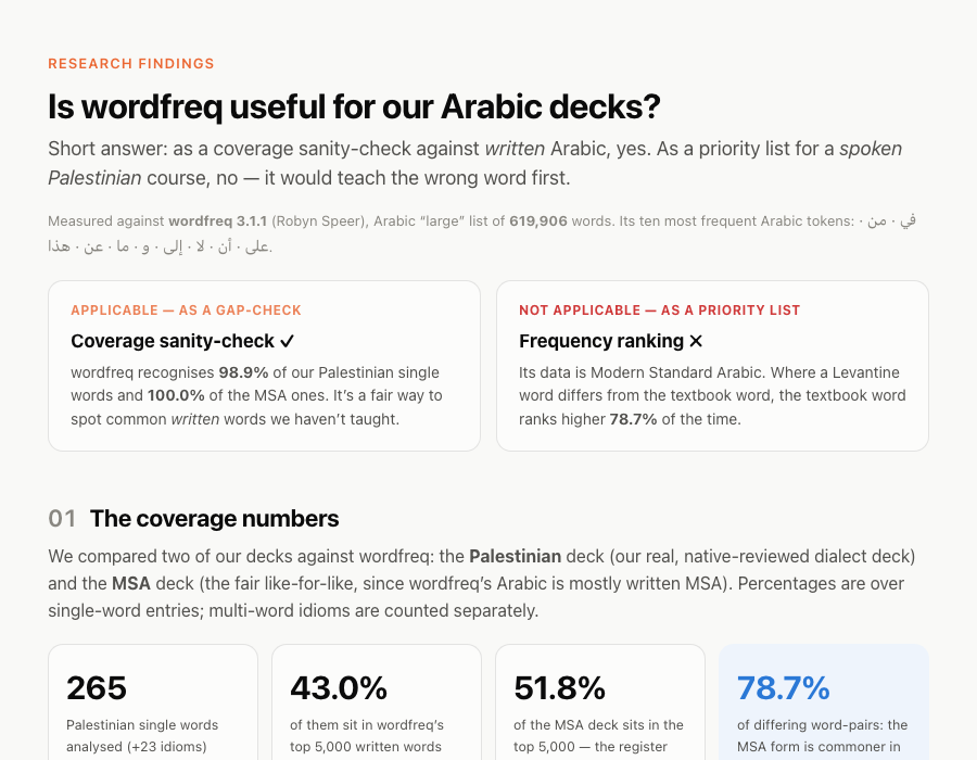
A findings page. Answering a research question as a page, not a doc.
A redesign. Six settings collapsed into one scannable list, tried before it shipped.
A working mockup is a few hundred lines. A shipped feature is thousands, plus tests, plus everything that never shows up in a demo. Testing the direction before any of that exists isn't a nice-to-have. It's the cheap insurance.
"HTML is the new markdown." He'd stopped writing markdown for almost everything, switching to asking Claude Code for HTML instead, backed by 20 worked examples across 9 categories.
A skill people at Anthropic use a lot: /eli5 <what you want explained>. The system prompt behind it: "explain like I'm someone who knows nothing about this topic," in an HTML artifact with big pictures and few words.
It reads the request. No files change yet.
It proposes an approach: what it'll build, in what order.
You read the plan and say yes, change it, or stop.
Only now does it touch a file.
At each word, the model isn't recalling a fixed response. It's weighing many plausible next words and choosing among the likely ones, not always the single most probable. That's on purpose: always taking the safest word produces flat, repetitive text.
And because each word shapes what comes next, one different word early on reshapes the whole sentence after it. Small randomness, compounding difference.
Ask for the same thing twice and you'll get two different answers, in code or in a plan. You can't fix that, and you don't need to. You just want a cheap pull, so trying again costs a prompt, not a rewrite.
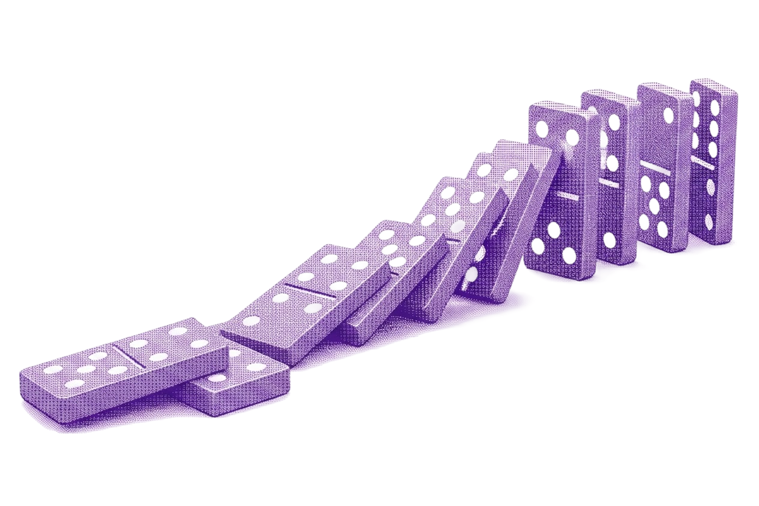
Like dominoes: knock one over, and it knocks the next, and the next. A screen is dozens of tiny decisions. Get almost all of them right, and it can still end up wrong.
Every line of real code costs tokens and time to generate, and Claude will happily spend all of it on an approach you don't actually want, because nothing stopped it before it started. The fix isn't slower. It's earlier.
Claude writes clearly, at length. A real plan for a real feature can run several screens, and nobody actually reads all of it before hitting approve. The gate only works if you use it.
Confident, well-organized text is not the same as the right direction. Don't just read the plan. Ask Claude to show it, a quick HTML pass of the idea, and keep iterating that HTML, still in Plan Mode, until it's right, before you ever approve real code.
The session that built the thing is invested in the thing. A fresh session isn't. Point it at your original brief and the diff, and it'll report gaps the builder would have talked itself past.
Investigate wordfreq for the Arabic learning app + findings HTML page You asked whether wordfreq is applicable to your Arabic learning app, and to produce an HTML page with the findings. Findings page — docs/wordfreq-findings.html (new) Self-contained static HTML, inline CSS, no build step.
Voice AI conversation practice — mockup Before committing to real mic and API work, this pass builds a click-through mockup: one self-contained HTML file to validate the concept and the screen flow. A live interactive preview was shown in-chat during planning, so the flow could be tried before any file was written.
Profile section redesign — clickable HTML draft Miller's Law: six settings become one scannable list. Recognition over recall: every row shows its current value, so you see what's set without opening it. This plan covers a standalone, clickable HTML draft only. It does not touch the live app.
A color change, a copy fix, a spacing nudge, you already know what that looks like, so just make it. Save Plan Mode, and the HTML pass, for the direction you're actually unsure about.
That's recognition over recall. As a designer, I've always needed to see something to actually get it, not read about it. A plan you can react to does that. Code you have to parse doesn't.
Complex ideas compress badly into text. A quick HTML page with boxes, arrows, and a handful of words shows the relationships a wall of prose would bury: how a system fits together, what depends on what, where a decision actually branches. Works on any topic you'd otherwise need a meeting to explain.
Asked Claude to explain, in plain language, whether a new voice vendor was worth adding to my Arabic tutor app. No jargon. Just: what changes for the learner, and why it might help. A plain HTML diagram of how your own app actually works is the fastest way to keep understanding what you're shipping.
One file, read at the start of every session. Add a line telling it to always draft a quick HTML pass first, and it will, every time, without you asking.
Before every push, mine runs a design-system check, a frontend code check, a content check, and takes before/after screenshots for the PR. Skills specialize as models change, so it's worth refreshing yours every few months, not just once.
A prompt you'd otherwise retype becomes a saved command. Write the instructions once, invoke it by name from then on.
Claude can read your actual Figma file directly, not a description of it typed into a prompt. Fewer rounds of "no, the other blue."
Nothing changes without you clicking yes, every single time. Safe. Slow.
Where this whole talk lives. Free to explore, locked until you say go.
Faster, once the pattern earns your trust. Not where you start.
Approving a plan you didn't read is the same failure as shipping code you didn't review. Just faster.